
Homemates
Innovating the roommate discovery process to create more meaningful living experiences.
Project Scope
Duration: 2 weeks
I worked on a team where we collaborated on all aspects of the process. I conducted a user interview, assisted with developing personas, did a user journey, worked on sketches, and built wireframes.

Overview
Homes.com has been helping people find homes for over 40 years. They want to explore other services that leverage their network, infrastructure, and reach. One of their interests is the sharing economy. Is it viable for Homes.com to explore a new platform with a focus on the sharing economy?
Challenges
Is it viable for Homes.com to explore a new tool?
What can Homes.com do to separate themselves from the other sharing economy websites?
Should we design for mobile for desktop?
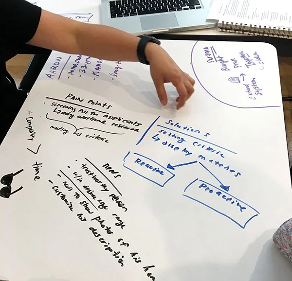
Solution
Homemates.com is a companion website to Homes.com that will transition the company into the sharing economy — all while revolutionizing the roommate discovery process to create more meaningful living experiences. It does so through its secured rental listing process and proprietary compatibility algorithm to successfully match roommates.

HIGH FIDELITY WIREFRAMES

- Homes for rent are showcased in the top hero image
- Since Homemates.com is a new tool for Homes.com, wanted to list three easy steps quickly for users

- On Aaron's listing page, a viewer can quickly scan his photos
- The main points are listed in a larger font with images: monthly rent, availability, neighborhood and how many bedrooms/bathrooms
- A photo of Aaron and more details on the listing and also a chat box near his photo for
Google Forms Survey

Competitive Analysis

Key Findings:
- Similar homepage layout
- Built-in chat feature was not as common
- Only Airbnb really showcased both the space and host well
- We were able to draw upon features we wanted to add to make Homemates.com stick out from the competition
- built-in chat
- personality questionnaire
- images of both home and person
Interviews
We conducted interviews and were able to draw on these takeaways:
International students weighed price over compatibility, but compatibility still influenced their apartment hunting
Students like Airbnb because you can view the profile of the person you live with
A short-term lease is important to students
When renting out a room in a house, home owners often go on a verbal agreement
Homeowners would wait for the right person to be able to move in
Finding a renter on Craigslist took an average of 12–14 days and the owner would also have to security screen on his own

Post-interview white boarding
User Journey
We conducted two user journeys: One with the user listing a room for rent on Roomi.com and the other with the user searching for a place to rent on Craiglist.com. From our Google Forms survey, Craigslist is still used by 50% of people to find a new place to live, despite Craigslist being spammy and lacking verification from users. Although, the advance search features were a plus for the user and in the particular listing we looked at, the user was impressed with the image gallery and in depth description, it did have it’s pain points.

User Journey
Pain points:
Not seeing a layout of the room. User was slightly frustrated not knowing if there was a closest within in the room or able to see an overall layout.
The listing requested to see the user’s LinkedIn and Facebook before meeting or showing the apartment, which left her wondering, “Why can’t I also view their social media accounts?”
The biggest frustration was not being able to contact the listers. There was no email or phone number, which left the user wondering how to contact the listers. Ultimately, she gave up after already dedicating time to find and read the listing.
Pluses:
The listers were thoughtful in their description of the home
List of points of interests in the neighborhood
Nice gallery of photos of the space
Primary Personas
On this project, we had to come up the personas on our own. From our interviews and research, we were able to develop three solid personas.
Our primary persona: Aaron | 35 | Self-employed | Home Owner | Looking to rent out an extra room in his home.


Primary Persona and the storyboards I illustrated for each of our three personas
Revisiting pain points from interview to help solidify our persona
User Flow - Primary Persona

Aaron's User Flow
Ideation
As a team, we all brainstormed ideas and collectively created rough sketches of the wireframes. We decided that there would be a dashboard page for a profile, where a user could access all his or her information, matches, and see who his viewed his or her profile.

Ideation

Ideation - I would like to explore my top sketch on the left as a possible "View My Matches" page
WIREFRAMES

Designs of homepage and an early design of the search results

Profile page designs

Match results design
Design Challenges:
One of our challenges was catering to three different personas:
- Person seeking a new home
- Person seeking a roommate
- Person seeking both a new home and roommate
We solved this on the individual profile pages and ion the match page. The user can slide the results to either:
- New Homes Only
- Homemates Only
- Both


Dashboard designs

Questionnaire page

Home page - logged in // Aaron's Listing Page

As I was working on the high fidelity wireframes, I decided to make the "log in/ sign up" page a modal instead of a separate page as we had in the early wireframes. I did this so that if the user just wants to explore the homepage without logging in, he or she can do so and make the login page quicker.

The user is able to preview his or her listing before submitting. The next screen communicates to the user that the listing has indeed been submitted and will be reviewed - another way we wanted to build in the security of the site.
Usability Testing
Major Findings:
The hierarchy of text and images is very important and we had overlooked it in some parts of our wireframes
Someone unfamiliar with online dating questionnaires may find the lack of instructions on questionnaire page confusing
The copy below the icons on the front page proved to be confusing
Usability Test
Next Steps
- Create a customizable renter template page in a resource section
- Explore different ways to design the "Matches" page and "Neighborhood Guide" page
- Be able to accept rental payments, so that Homes.com could generate profit from Homemates.com
- Connect social media feed, such as Instagram within profile